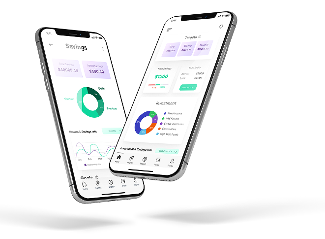
A promising product with a comprehension problem
Sortika is a Kenyan micro-savings and wealth management app. The pitch is compelling: smart financial planning and investing that earns above-market returns, built for people saving toward real life goals.
When I came on board as the UX researcher and designer, I inherited a product with strong ambition and weak comprehension. The app was hard to navigate, its services were unclear, and first-time investors bounced off concepts like peer-to-peer lending without ever understanding them.
"Out of 26.4% of users who uninstalled the app, 19.6% reported they did not understand how it works."
That single finding became the north star for everything that followed. This wasn't a visual polish project. It was a comprehension project.
Too many problems, too little time
I started with preliminary research: stakeholder interviews to learn what had been tried before, then a 500+ response survey run with the support team, moderated usability testing, and deep user interviews into how people actually think and talk about money.
The pain points clustered fast: impossible navigation, unclear services, no consistent way to save toward goals, confusing lending concepts, weak planning tools, and no real access to investments. More problems than any one sprint could fix.
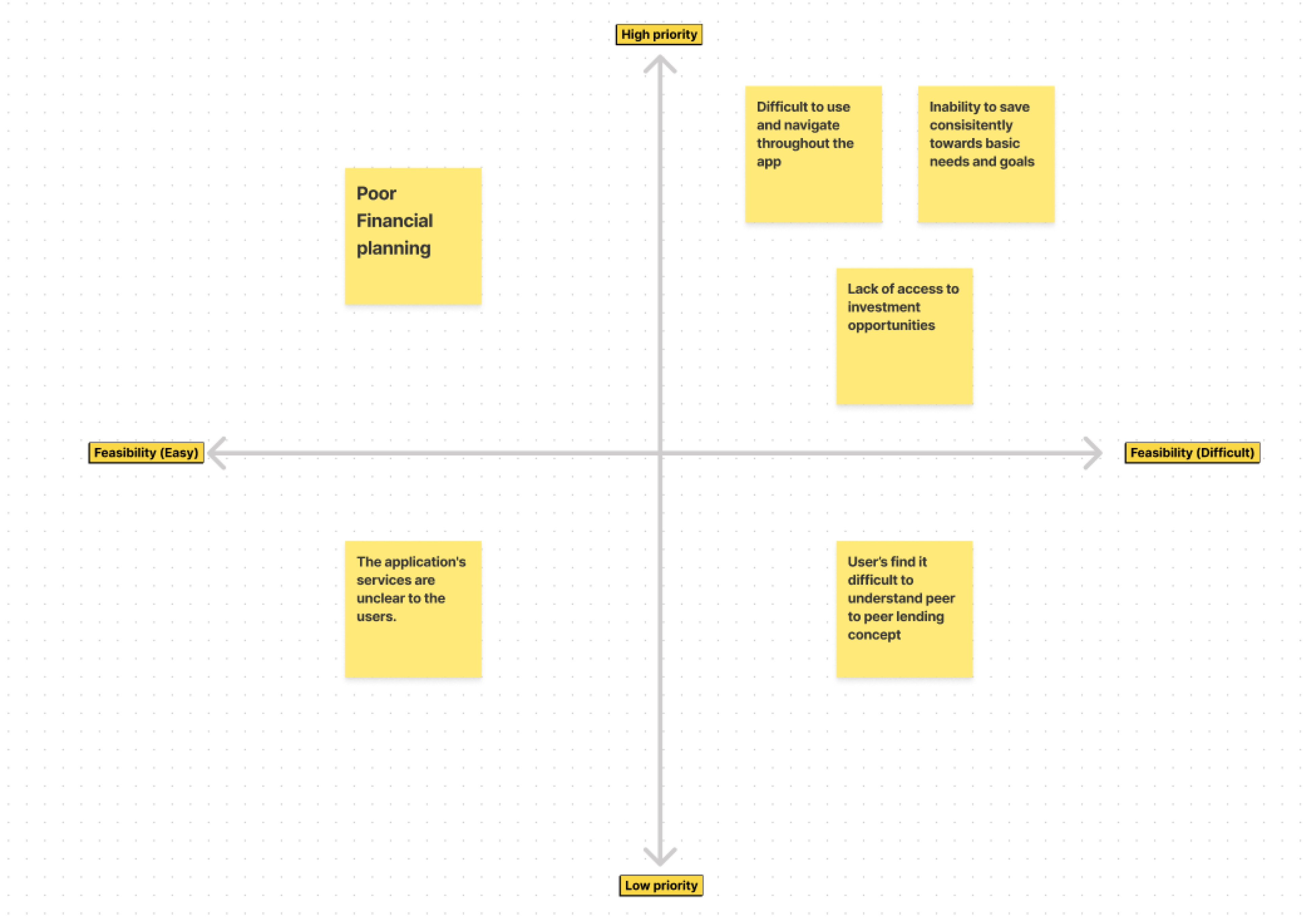
So I ran a prioritization matrix with the team. It gave us a shared mental model and a consistent way to decide what to fix first, instead of arguing from opinions.
Stakeholder interviews
Mapped previous attempts and aligned on where research would pay off most.
Survey
Surfaced concerns and improvement areas at a scale interviews couldn't reach.
Usability testing
Moderated sessions identifying the biggest pain points in the live app.
User interviews
Mental models, goals, and the real language of money.
Make the app explain itself
Make every service discoverable. No more hidden features; users should grasp what the app does within minutes.
Help users save consistently. Goals they set themselves, with visible progress that keeps them going.
Demystify investing. Plain-language tools plus a virtual assistant, so first-time investors never feel stuck.
What the research actually told us
Navigation chaos. Users couldn't find services they needed because the information architecture mirrored the org chart, not their mental model. The fix had to be structural, not cosmetic.
The comprehension gap. 19.6% of churned users left because they didn't understand the app. Financial concepts were presented in industry language to people encountering them for the first time. Every screen had to teach.
Saving without a target fails. Users wanted to save but had no mechanism tying money to meaning. Goal-based saving, with categories and visible rates, turned an abstract habit into something concrete.
These insights distilled into three personas that drove every design decision before a single wireframe was drawn.
Matt, 29
Slow investment returns, hours lost tracking markets, burned by Ponzi schemes.
One app for all financial services and a real variety of market opportunities.
Filly, 35
Struggles to repay loans on time and understand complex financial platforms.
Learn about investing, and save for school fees, rent, and starting a business.
Deborah, 24
Frustrated by unsecured lending and waiting endlessly for returns.
Build emergency funds, invest, borrow when needed, and save for a holiday to the Maasai Mara.
Three flows, rebuilt around clarity
Every screen explains itself. Every number earns its place.
The dashboard that orients
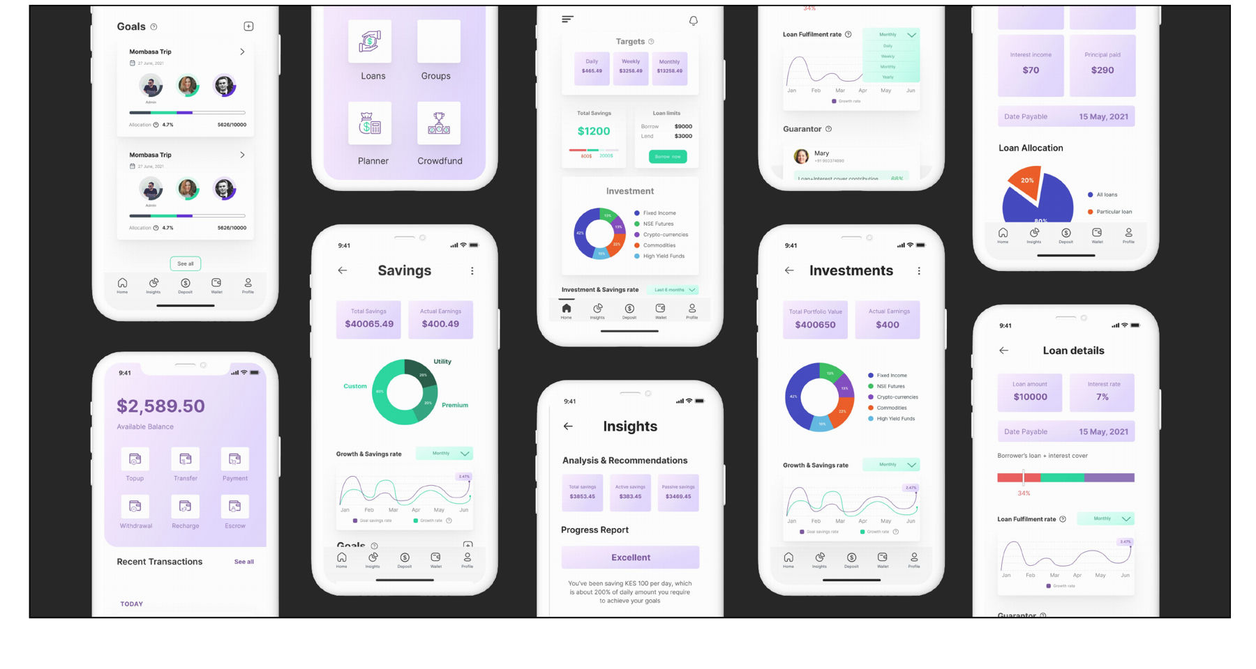
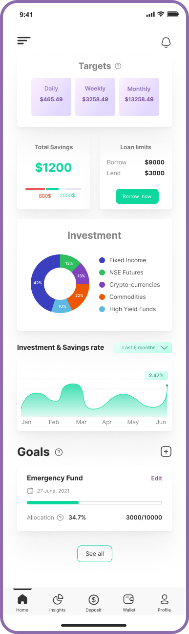
One home for everything: savings, loans, and investment containers with daily, weekly, and monthly targets, visible loan limits, and portfolio overviews. Users always know exactly where their money stands, the antidote to the navigation chaos from Key Insight 1.
Saving with a target
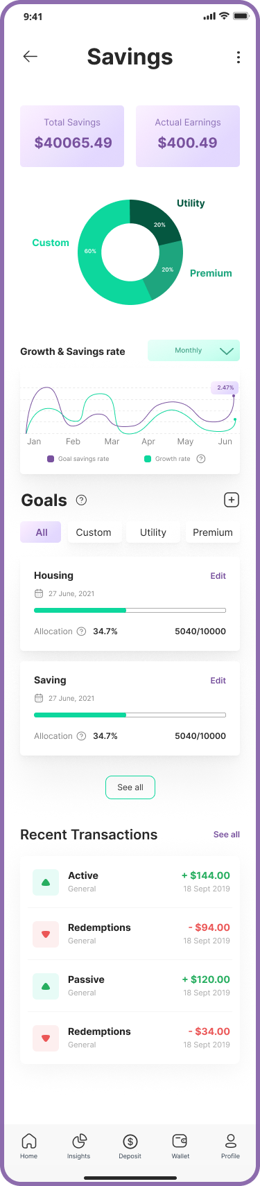
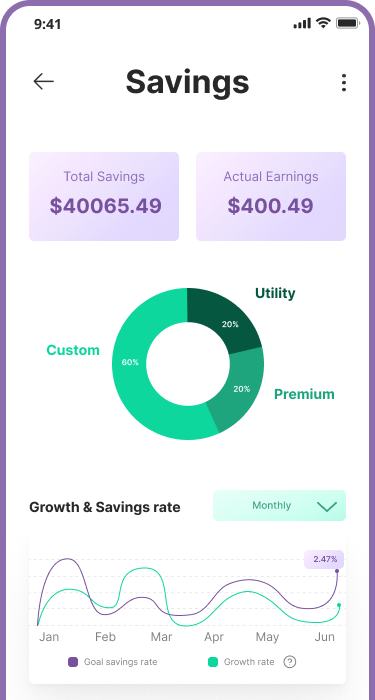
Goals users set themselves: emergency funds, holidays, school fees. Category breakdowns show where savings actually go, savings-rate graphs keep progress visible, and full transaction history makes every shilling traceable.

Investing without the jargon
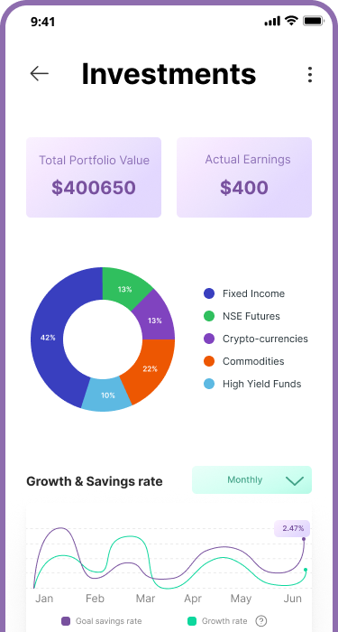
Portfolio distribution at a glance, curated suggestions with hypothetical projections, and a virtual investing assistant that answers questions in plain language the moment users feel stuck. Built directly from Key Insight 2: every screen teaches.
What this project taught me
Domain expertise is learnable, but only if you ask enough questions
I designed a financial app with no finance background. My team's generosity in explaining the domain made it possible, and it's why I now start every 0→1 project by learning the domain first.
Research is most powerful when stakeholders watch it work
The team didn't adopt UX research because I advocated for it. They adopted it because they saw findings turn into design decisions in real time. Show, don't tell.
Comprehension is a feature
For first-time investors, clarity isn't polish, it's the product. The highest-leverage design work here was translation: industry concepts into human language.